Web & Digital Experiences
UI/UX Design
Research-led interfaces that make products and portals easier to use.
02 / Web & Digital Experiences6 capabilities · 7 deliverables
The problem
A product people have to be trained to use
Software gets built feature by feature. A request comes in, a screen is added, a setting gets a toggle. After a year, the interface reflects the order in which things were built, not the order in which people do their work. New users need a walkthrough, support answers the same questions weekly, and experienced users develop workarounds the team never sees.
The usual response is to ask users what they want, which produces a list of features rather than an understanding of the job. Without watching people attempt real tasks, teams argue from opinion, and redesigns tend to move the same confusion into a different layout.
Sound familiar?
- Support tickets are mostly how-do-I questions about existing features
- New users sign up but stall before completing the first meaningful task
- Staff keep side spreadsheets because the system does not match their routine
- Design decisions are settled by whoever argues loudest in the meeting
Our solution
Understand the task, then design the flow around it
We begin with the people who use the product: interviews, session recordings if you have them, and observation of the actual task. From that we map the jobs users are trying to do, where they hesitate, and where the current flow forces them to think about the system instead of their work.
Designs are then built as clickable prototypes and tested with five to eight representative users before any code is written. That is enough to surface the majority of usability problems at a point where fixing them costs a design revision rather than a development sprint. What reaches developers is a validated flow with defined states, not a guess.
Capabilities
What's inside.
- 01
User interviews and task observation
Structured conversations and screen-share sessions with customers and staff, focused on what people do rather than what they say they want.
- 02
Journey and task-flow mapping
End-to-end maps of key tasks that mark each decision, hand-off and failure point, so redesign effort goes where users actually struggle.
- 03
Interactive prototyping
Clickable prototypes at realistic fidelity for testing, stakeholder sign-off and developer reference, built in Figma.
- 04
Usability testing
Moderated sessions where representative users attempt defined tasks, with findings ranked by severity and tied to specific screens.
- 05
Interface and component design
Screens, forms, tables, empty states, error messages and loading states designed as a coherent component system, not one-off pages.
- 06
Design system foundations
Tokens, components and usage notes that keep a growing product consistent as more people contribute to it.
Process
How the work unfolds.
- Step 01
Discovery and research
We review analytics and support history, interview users and stakeholders, and write down the tasks that matter most and the problems blocking them.
- Step 02
Flows and wireframes
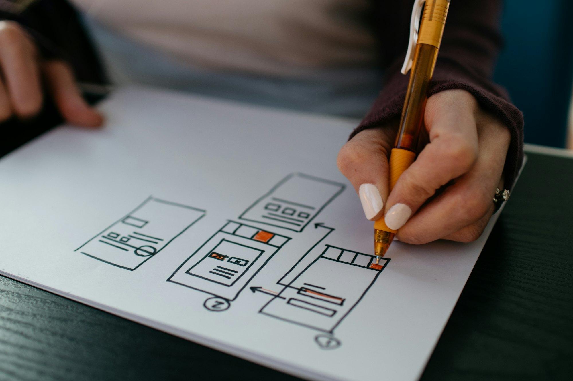
Core task flows are mapped and sketched as wireframes, then reviewed with your team to confirm scope and edge cases.
- Step 03
Prototype and test
A clickable prototype is built and put in front of real users. We observe where they stall and revise the design based on what we saw.
- Step 04
Design delivery
Final screens, states and component specs are handed to engineering, and we stay available during the build to answer questions and review the result.
You receive
Deliverables
- 01Research summary with prioritised findings
- 02User journey and task-flow maps
- 03Wireframes for all core screens
- 04Clickable Figma prototype
- 05Usability test report with ranked issues
- 06High-fidelity UI designs including states and edge cases
- 07Component library and usage guidelines
Where it fits best
- HealthcareLocation pages, booking flows, reviews and patient communication, built with privacy and the plain language patients actually search in.
- EducationProgramme discovery, enquiry-to-enrolment funnels, and the CRM plumbing that stops prospective students slipping between teams.
- Professional ServicesAuthority-led content, specialism pages that rank, intake forms that qualify and CRM workflows that make referrals measurable.
- Startups & SaaSProduct sites, demo funnels, onboarding flows and growth instrumentation, shipped at the pace a young product needs.
FAQ
Questions we get asked.
Do we need user research if we already know our customers?
You know what they ask for, which is different from how they behave when completing a task. A short round of interviews and observation usually turns up two or three problems the team had stopped noticing. If you have recent, good research already, we will use it and skip that phase.
How many users do you test with?
Typically five to eight per round, chosen to match your real audience. Small rounds find most of the serious usability problems, and running two short rounds is more useful than one large one because the second checks that the fixes worked.
Can you redesign an existing product, or only new ones?
Both. For existing products we start from analytics, support tickets and observation of current use, then redesign the highest-friction flows first instead of rebuilding every screen. Incremental changes can often be released without a risky full relaunch.
Does UI/UX design include development?
Design and engineering are separate scopes. We hand over specified, tested designs that your developers can build, or we can build the front end ourselves through our web development service. Keeping the same team on both tends to reduce interpretation gaps.
- TechnologyWeb Application DevelopmentWe build web applications, SaaS products and customer dashboards with authentication, payments and a deployment pipeline that does not break on Fridays.View
- WebWebsite DesignVisual design, page structure and content hierarchy for business websites that explain the offer quickly and lead visitors to one clear action.View
- MarketingConversion Rate Optimization (CRO)Behaviour analysis, A/B testing and page-level improvements that raise the share of visitors who enquire, sign up or buy.View
Ready to talk about ui/ux design?
Send a few lines about what you're trying to move. We'll reply with questions, a rough shape of the work, or an honest no.
Or write to hello@asoftbit.com